When Daren Moseley took over as MD of Breyer at the start of the year, he naturally started with a review of the business, in order to seek out opportunities for improvement and growth. While a number of business improvements have since been undertaken behind the scenes, it was agreed that it was also time to refresh the Breyer brand and website. Happily, these are now ready to be unveiled!
Brand refresh
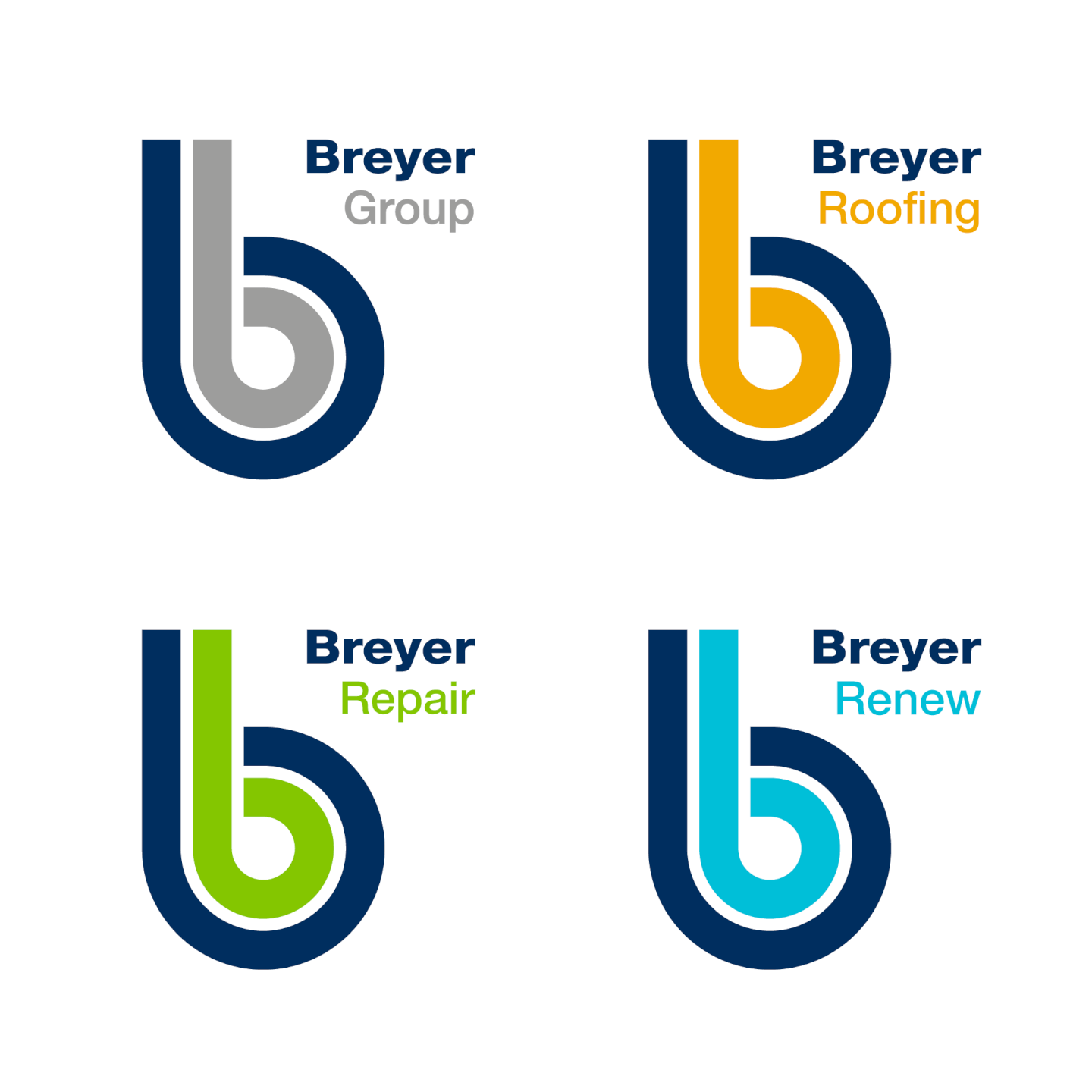
The updated Breyer brand retains the Group logo with its distinctive ‘b’ motif and now features related sub-brands for our three core service areas: roofing, responsive repairs and refurbishment. These now have short, memorable brand names – Roofing, Repair and Renew – each with their own identifying colour and icon. The result is clearer messaging around the services we offer with an injection of eye-catching colour.
Like Opal Fruits (the popular 60s sweets rebranded to Starburst in the 90s), we might have changed Breyer’s look, and updated some of our systems and procedures to boot, but the business itself remains the same at heart. The core family values upon which the company was founded will be kept firmly in place; as will our core service streams. We will continue to deliver professional property services in a personable, conscientious way; all while looking a little bit different.
Revamped website
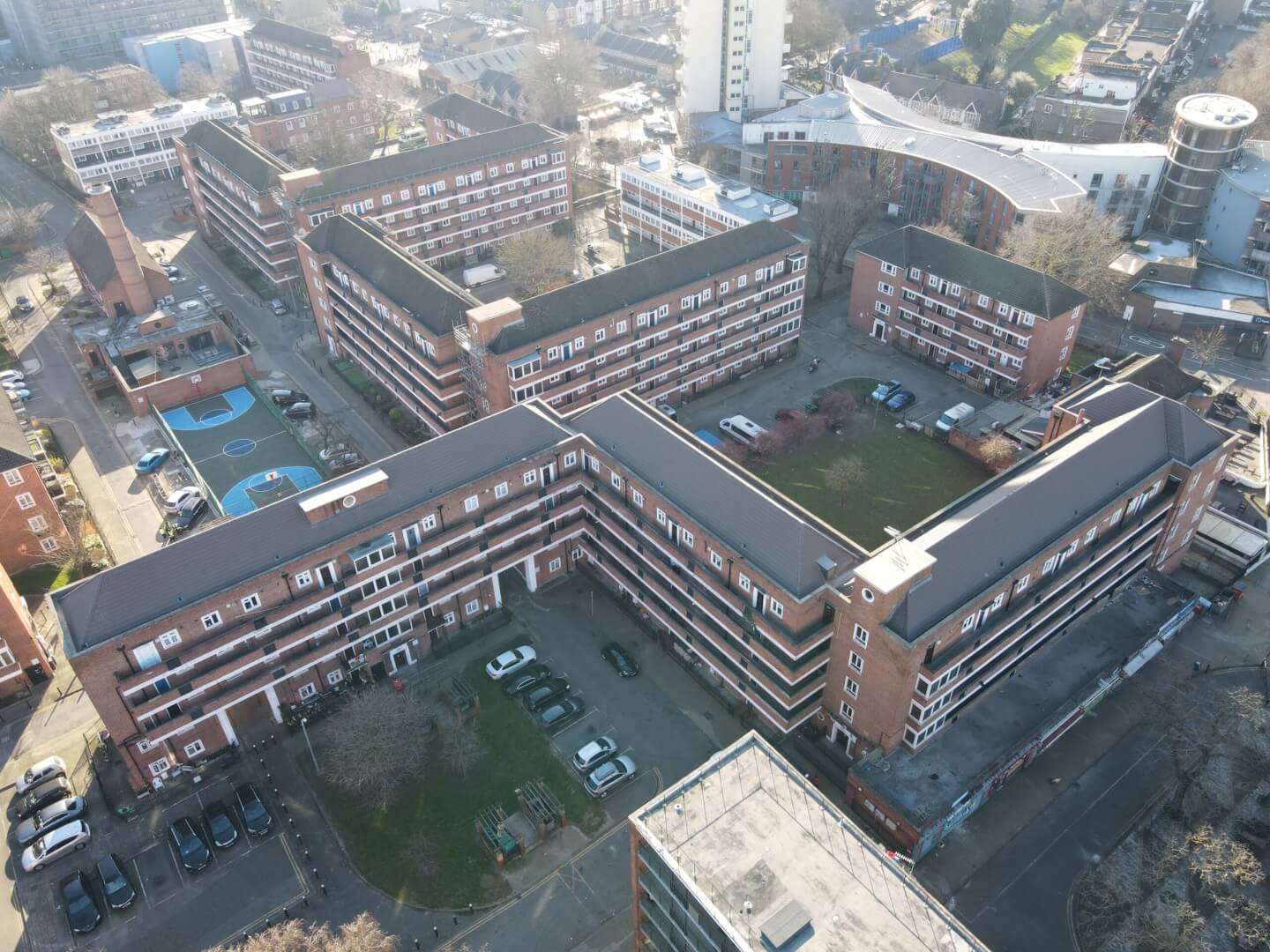
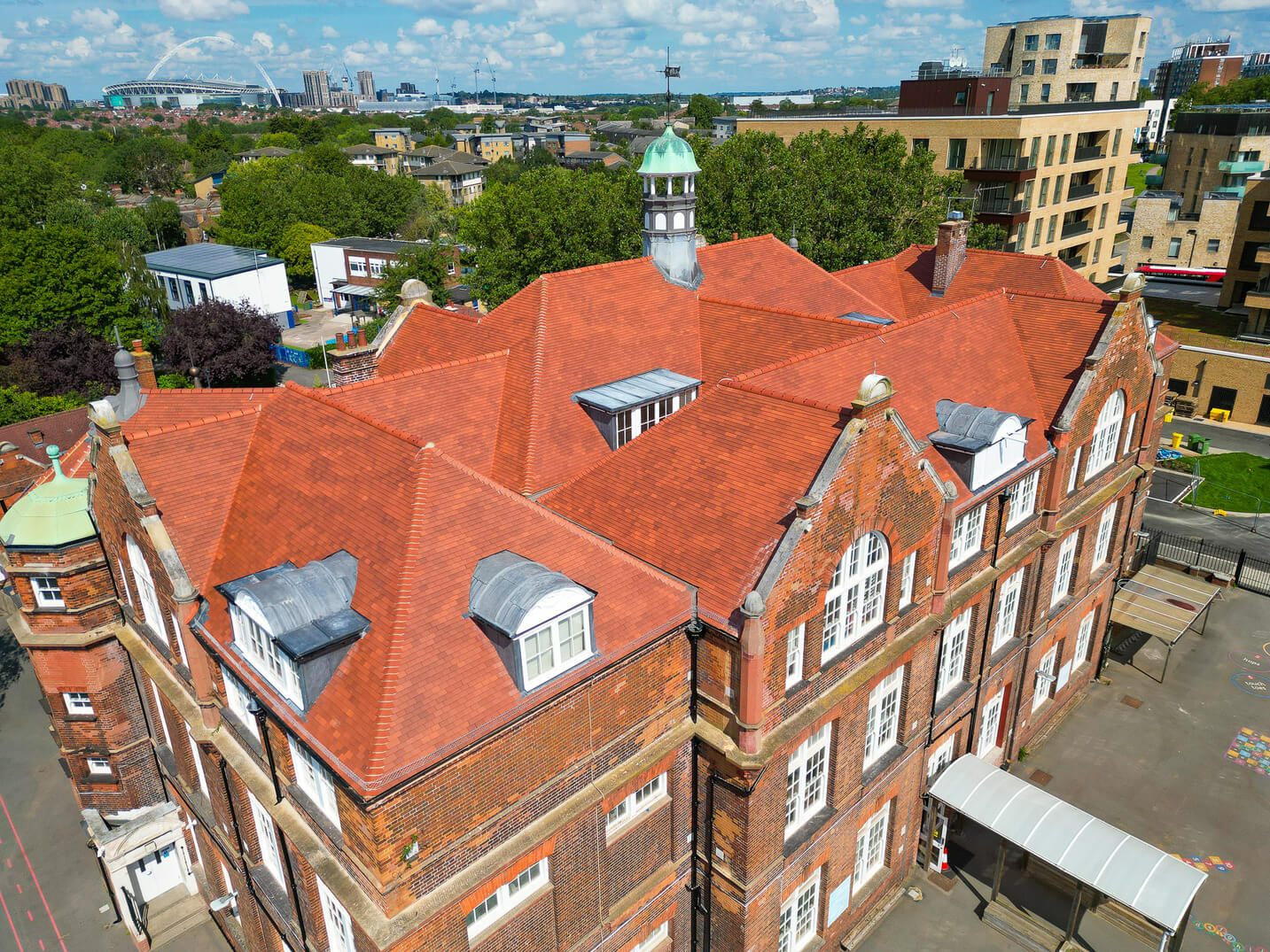
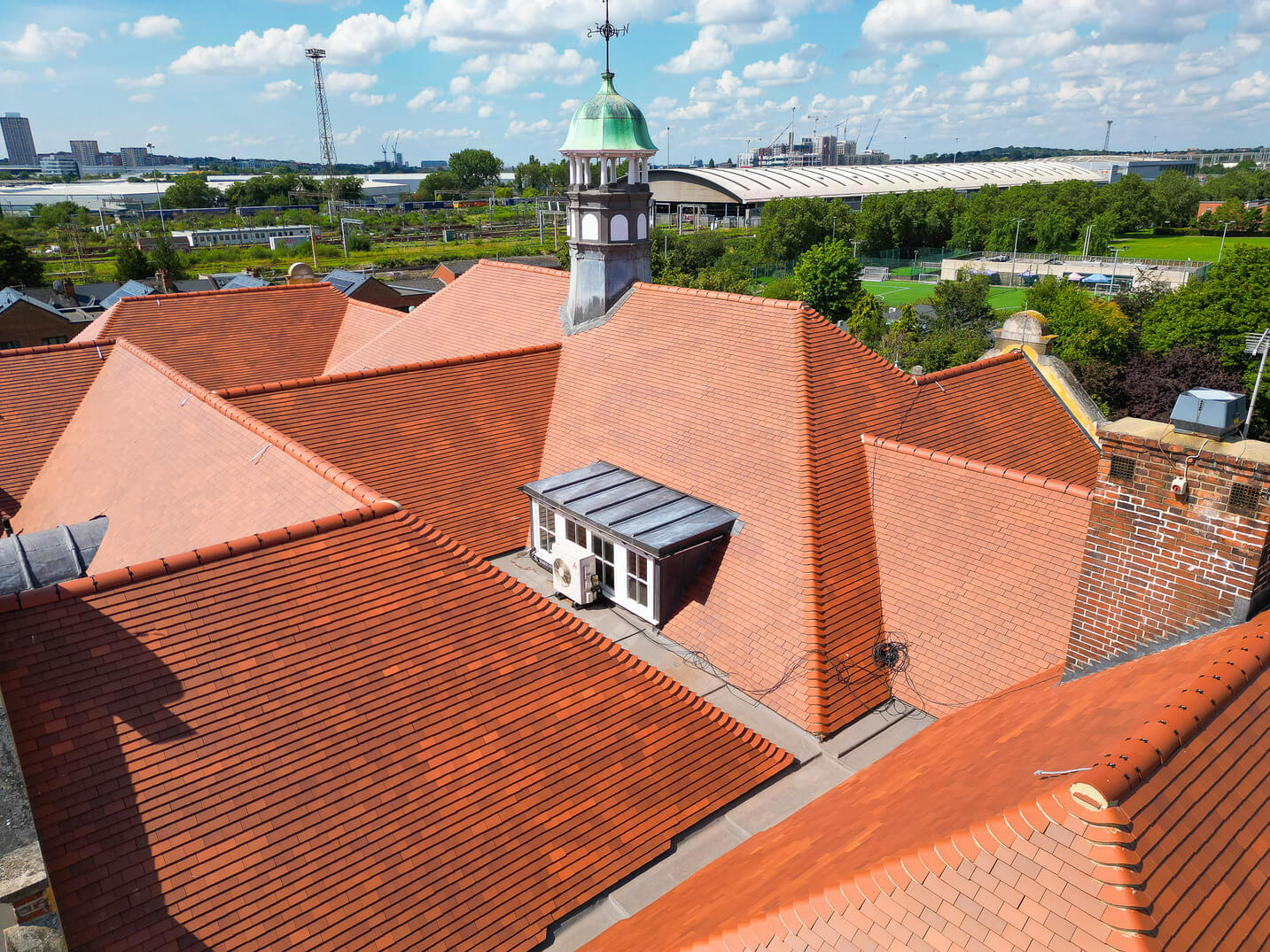
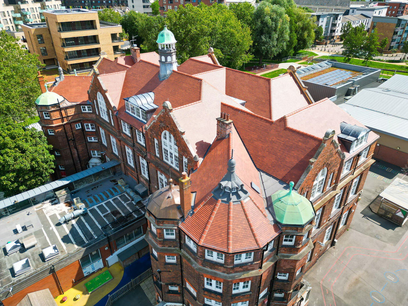
Along with the brand refresh, we’ve given the website a facelift. Like most companies, our website is an important first port of call for many of our potential and existing clients. So, the new site is designed to be easier-to-navigate and to reflect Breyer’s key values as professional, personable and conscientious. It also features our new branding, photography and messaging.
We’ll be adding more case studies, testimonials and photography over time but, for now, we hope this revamped website presents the best of Breyer’s work and approach for everyone to see. We welcome your feedback so please feel free to drop us a line at [email protected] to share your thoughts.
